
Kia Global


Kia introduces its new brand positioning
Kia’s global rebrand marked a pivotal shift in how the brand positions itself: Movement that inspires. More than a slogan, this concept redefines every consumer touchpoint from the design of vehicles to the experiences built around them—as an opportunity to spark inspiration.
With a new logo designed by Luc Donckerwolke and Blackspace, supported by a bold visual system from Innocean Berlin and the Kia Design Center, the brand identity embraces a confident, future-forward aesthetic. The graphic system draws directly from the new logo breaking it down into modular elements that serve as flexible, recognizable motifs across all media formats.
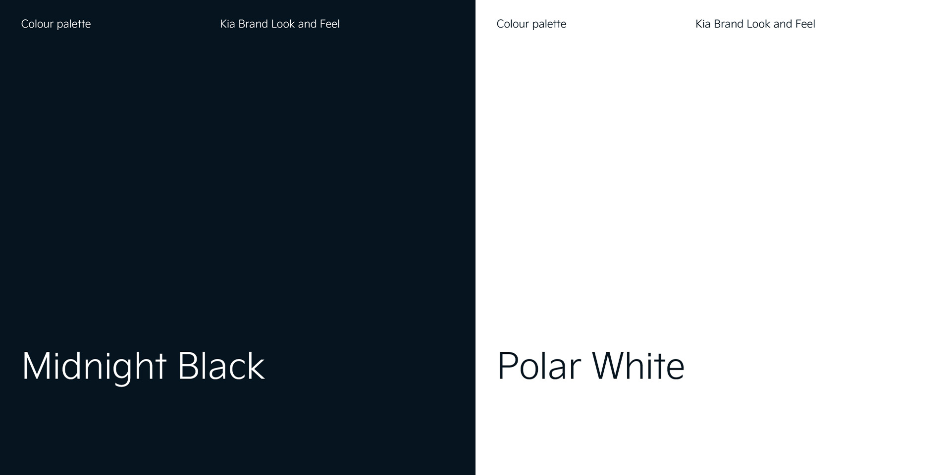
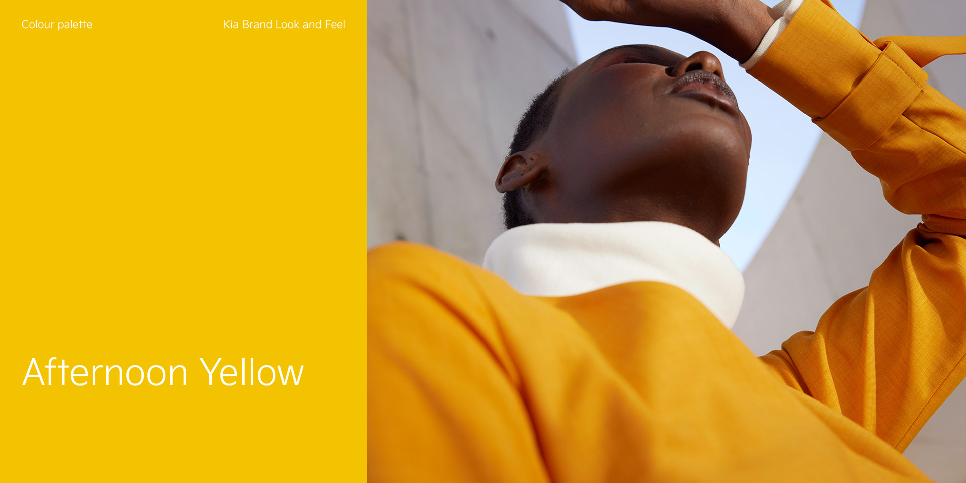
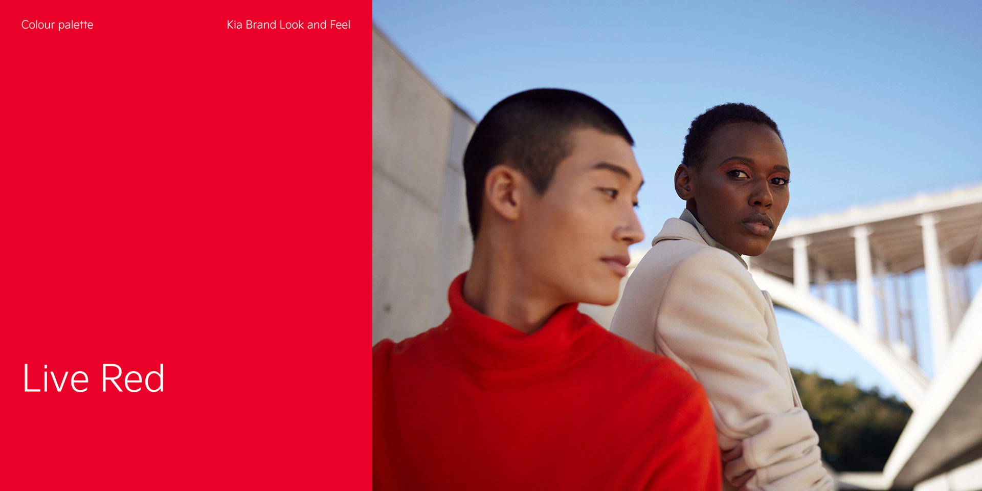
The color system sets a refined tone: Midnight Black and Polar White as primary colors provide a minimal, high-contrast base, while Afternoon Yellow, Forest Green, and City Grey offer emotional nuance in photography. Kia Live Red acts as a powerful accent used sparingly to inject energy and brand presence.
Taking the idea of “Movement that inspires” further, we collaborated with artists and neuroscientists to create campaigns that tap into how people experience inspiration. The brand launch included a digital out-of-home (OOH) campaign inspired by natural movement, a new sound logo, and brand music designed to increase focus and emotional engagement.
My Role:
As Art Director for Design, I led the visual and photography direction, helped shape the overall brand strategy, and developed the modular graphic system that defines the brand’s new visual language.