Innocean Berlin
Berlin Brand Identity
The rebrand of Innocean Berlin was about more than just visual design, it was about capturing the spirit of the city itself. Our task was to create an identity that stayed true to the global Innocean brand, while also reflecting what makes Berlin unapologetically Berlin.
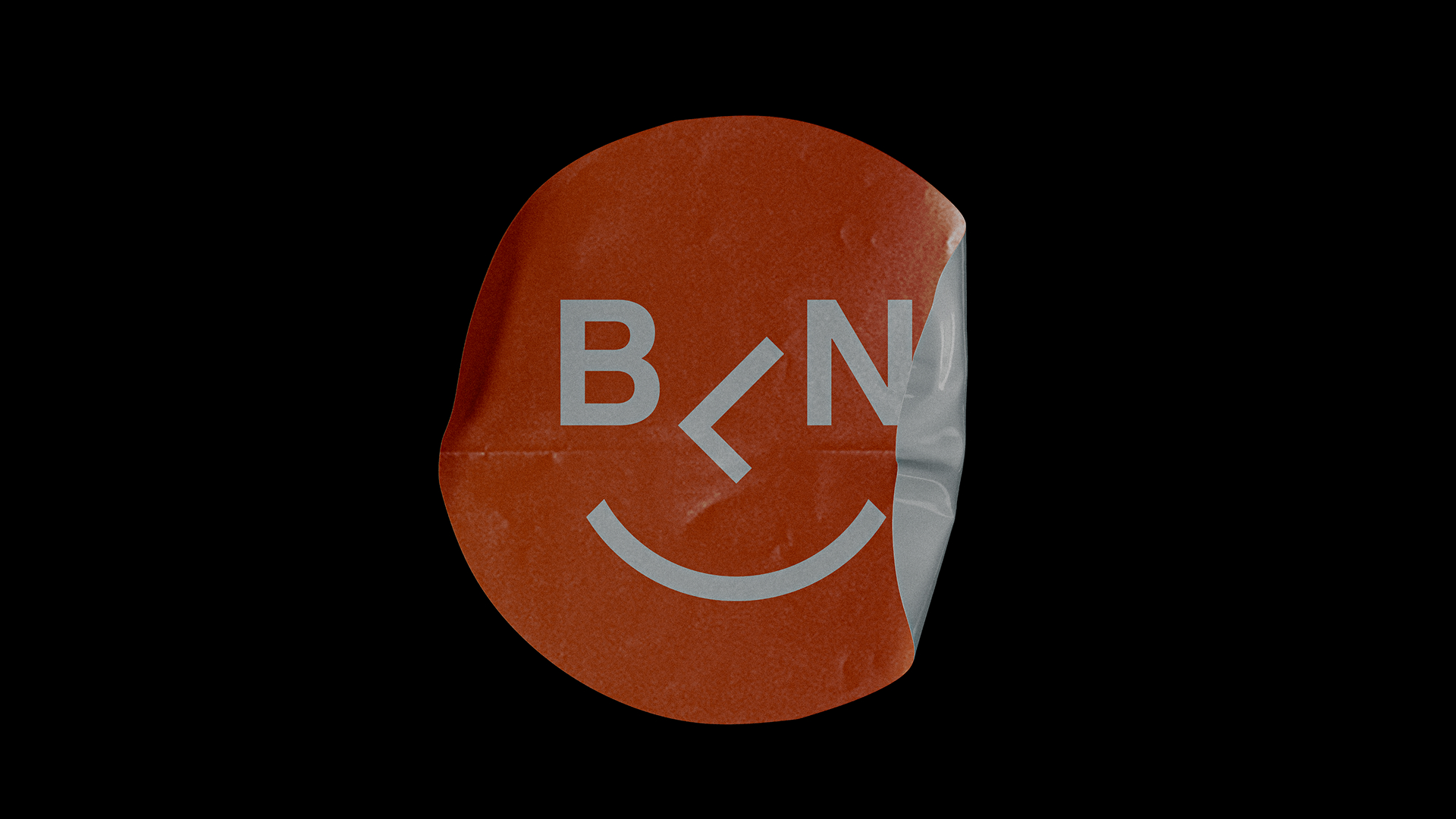
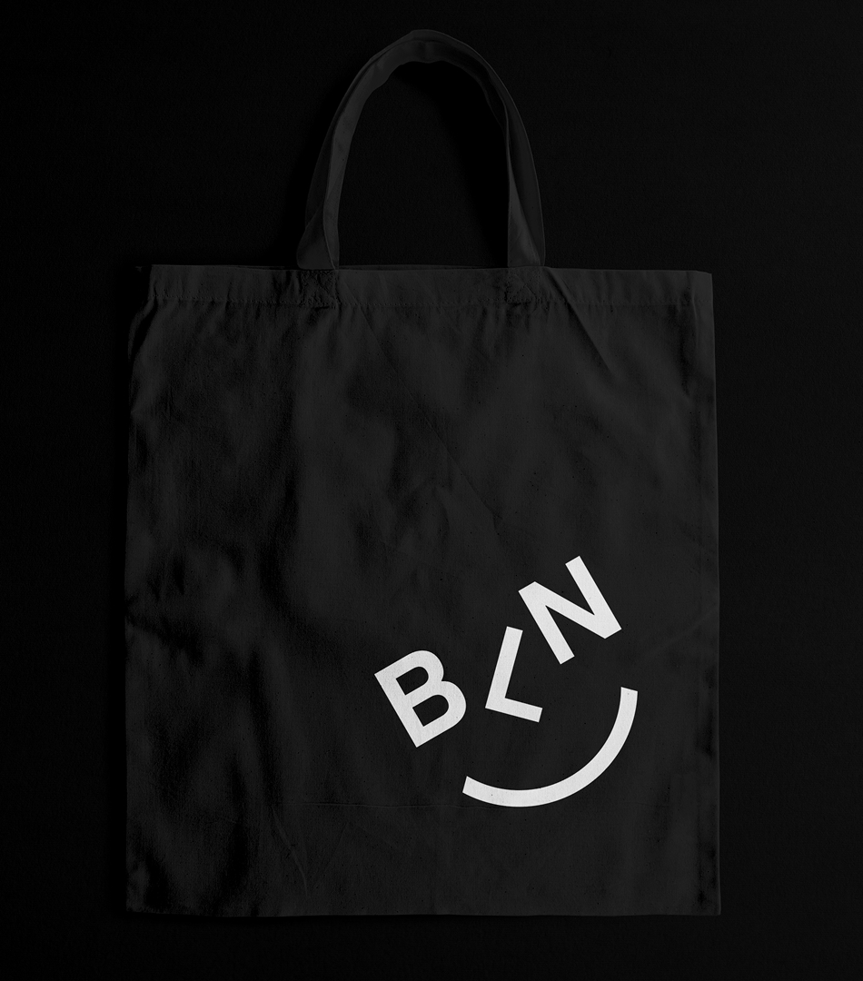
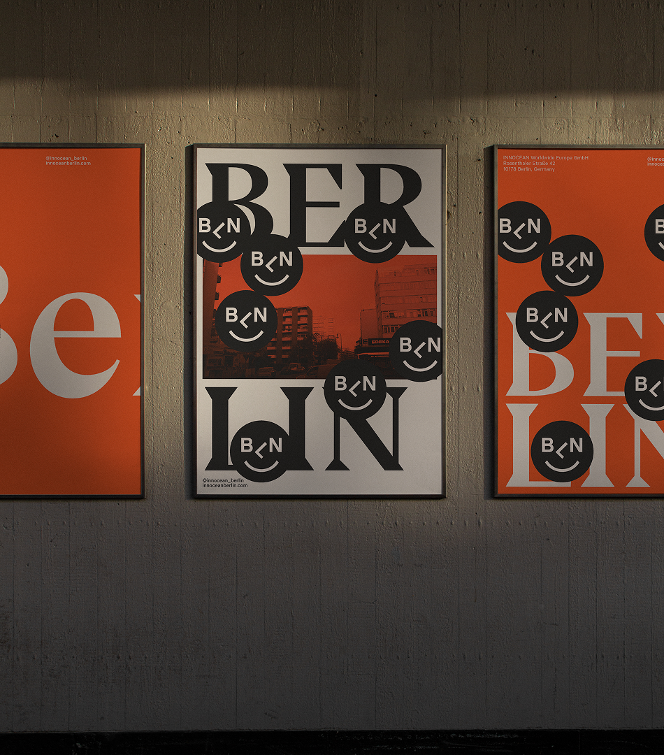
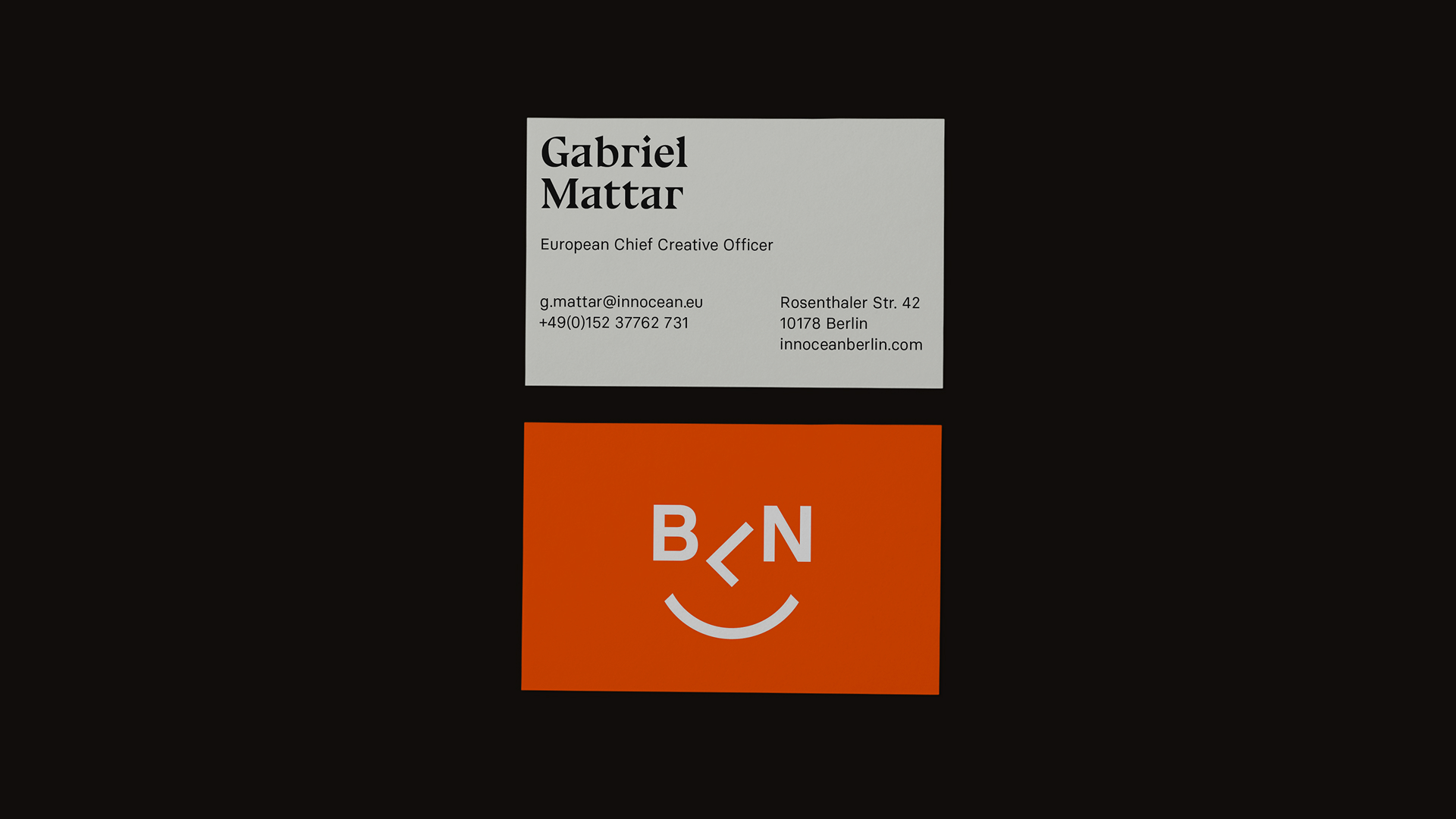
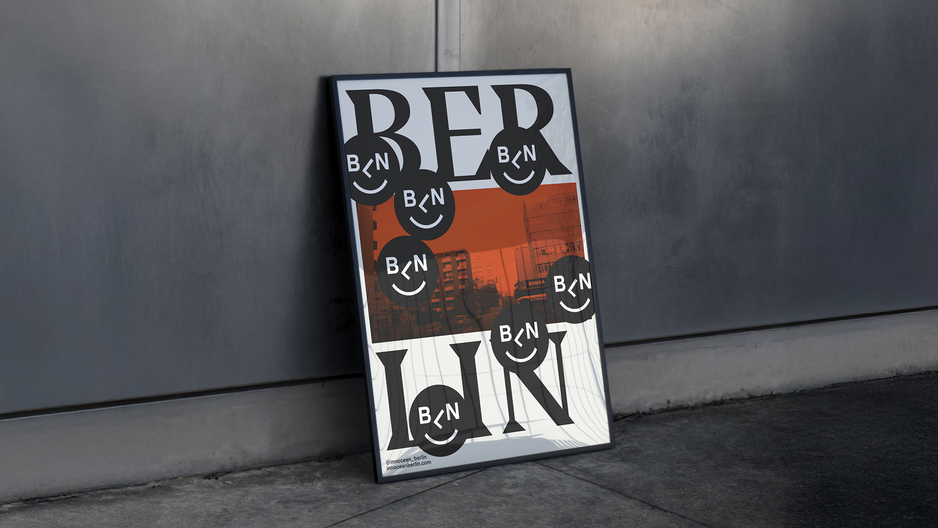
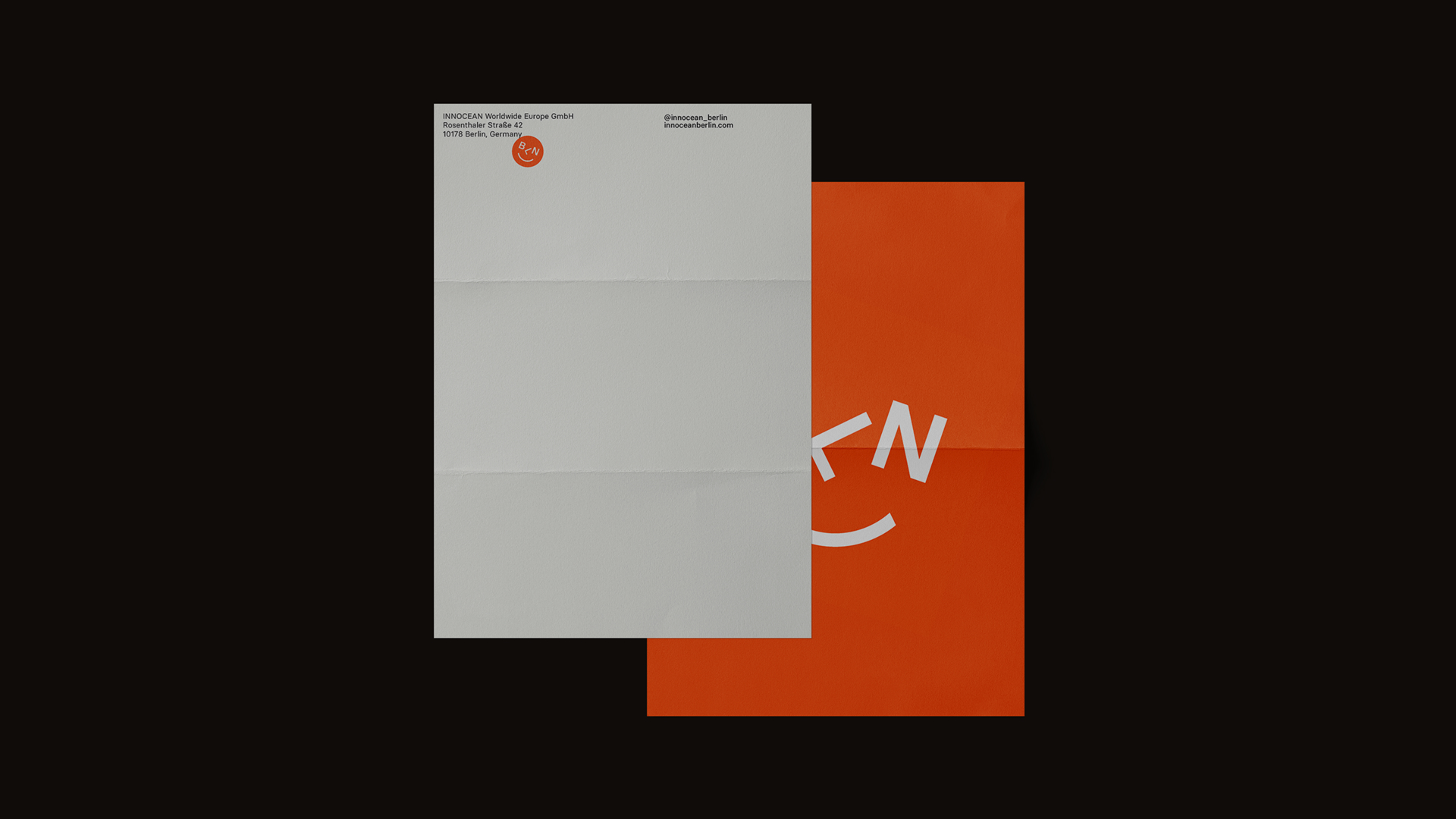
At the heart of the identity is a playful, minimalist smiley face, formed from the abbreviation BLN. This sets the tone for a city that doesn’t take itself too seriously—bold, direct, and a little cheeky. The system pays homage to classic German graphic design through its use of precise grids and typographic clarity, grounding the work in discipline and structure.
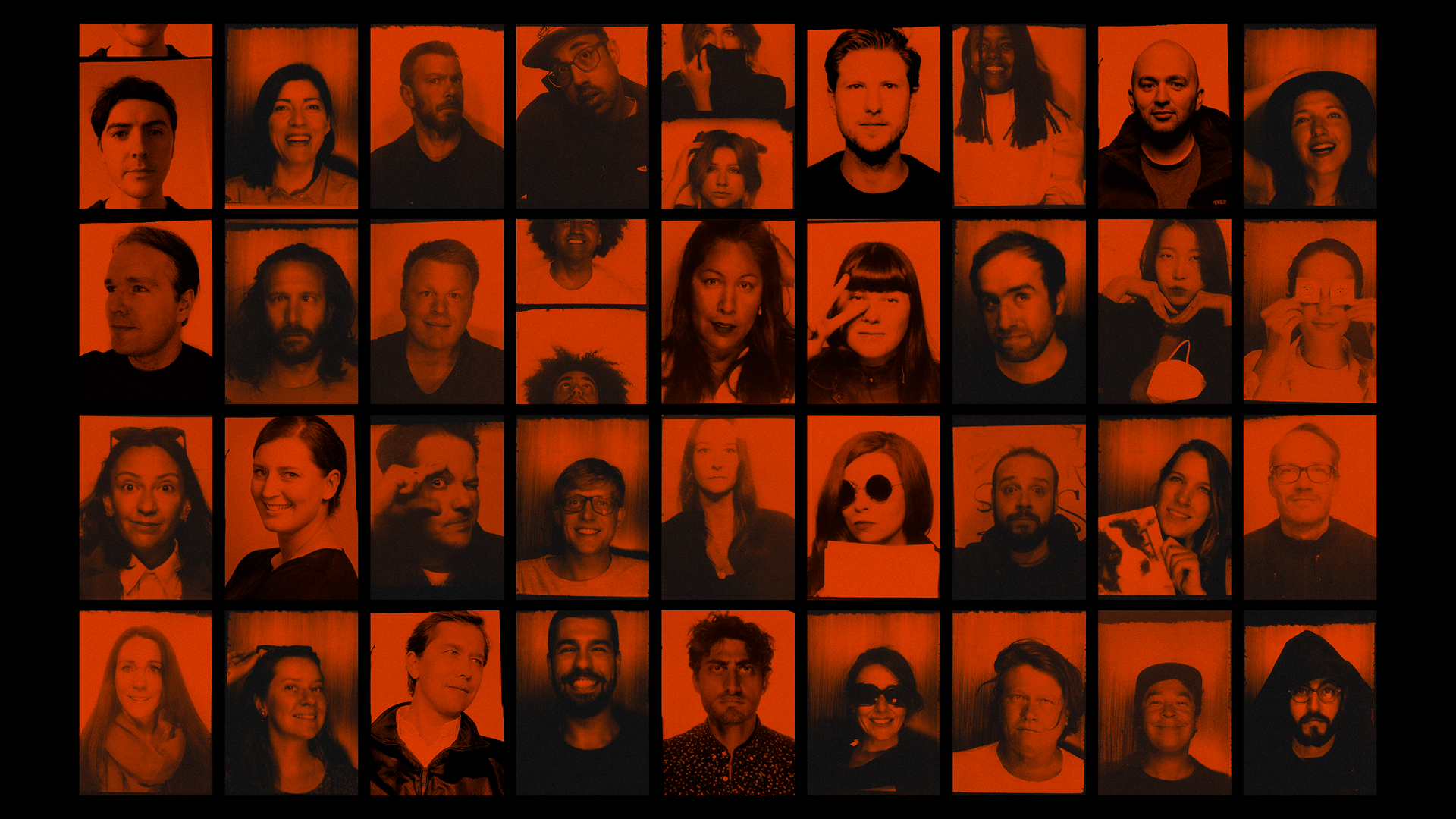
But it’s the textures, street sticker culture, and photobooth-style portraits that bring Berlin to life within the brand. These raw, personal, and spontaneous elements inject a layer of character that’s unique to the city - just like the people who work there.
The result is a visual identity that feels both globally aligned and unmistakably local: structured, expressive, and full of attitude.